
Insights:Looks like 2022 is going to be a Veri Peri year
Since 1963 the Pantone Matching System has been used by marketing, design, printing and other industries to provide color identification that is extremely specific. You may have seen the swatch books they produce that have a small square of color with a number that identifies the color. This allows colors to be reproduced in a myriad of mediums to exact specifications.
Each year, the Pantone Color Institute, a business unit within Pantone, selects a color of the year. They do this by following color trends around the world and also gauging the world’s attitudes and outlook. Their approach is obviously a mix of facts and conjecture, but these are people who do very little but think about colors year-round and they have an impressive track record of identifying the next big thing in color usage.
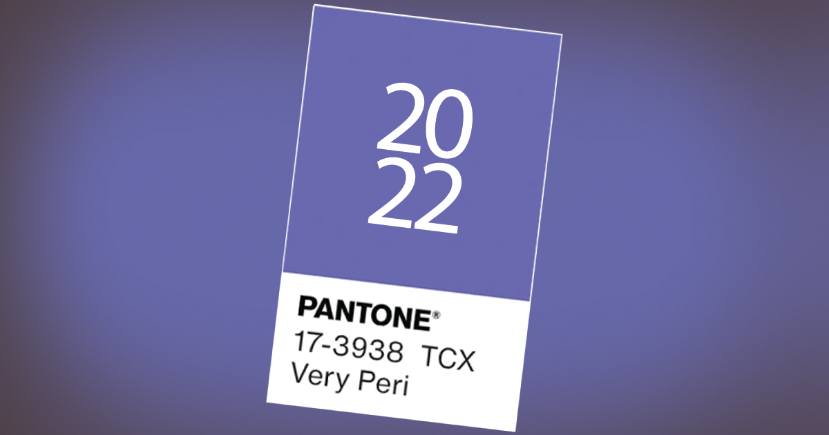
This year, the Pantone Color Institute has selected “Veri Peri” (Number 17-3938) as the 2022 color of the year.
It’s a very specific shade of periwinkle that combines blue with a violet red undertone. They feel this color “highlights the expansive possibilities that lay ahead of us.” The combination of the comforting blue with the energy of the violet undertones is supposed to reflect courageous creativity.
Considering all the challenges that 2021 presented the world, comfort and courage seems to be the ideal color message for all of us going forward. Keep your eye out for fashion, marketing, products and décor displaying Pantone’s 2022 Color of the Year to see if they nailed it.
If you’d like to learn more about color trends and usage, give our colorful design department a call at 605-275-0011 or send us an email.
Until next time, we wish you a Veri Peri new year!