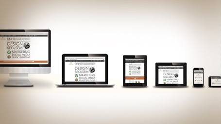
Marketing Insights: Is responsive design a big or small deal?

Actually it’s a big, kind-of-big, medium, a little smaller than medium, bigger than small, small and down-right tiny deal.
Responsive web design is quickly becoming the only practical solution to the myriad screen sizes people are viewing websites on. Gone are the days when you could build a website and a mobile site, and then assume you have covered all your bases.
All the different desktops, laptops, tablets, smart phones and various other gadgets — as well as those many devices that are sure to be invented soon — have made responsive design the only practical way to serve up your information to your audience.
Responsive web design simply means your site uses media queries to adjust the layout of your site respective to the screen size it’s being viewed on. Flexible images and fluid grids then adjust to fit the screen. Stated even simpler, your site fits in and looks right on virtually any screen.
There are really only two alternatives to responsive design:
Create a mobile site to fit different screens, with limited content.
Or, just accept that your site won’t be formatted for viewing by a large part of your potential audience.
Neither of which are very good options.
A new study by the Pew Research Center states that as of May 2013, 63% of adult cell owners use their phones to go online. The study found that smart phones and tablets are quickly over-taking desktop and laptop computers: 34% of cell internet users go online mostly using their phones, and are not using some other device such as a desktop or laptop computer.
Insight Marketing Design’s site is responsive, so if you want to see how it works, you can minimize the window you’re viewing this blog in or try it on your other devices.
Being responsive to your customers needs has always been a keystone of business success; responsive web design just takes that into the digital realm.
Next week’s topic – Four steps to an effective elevator pitch.

